
Write Clearly
Things You Can Do Today To Make Your Web Pages Accessible
In this section, we will explore some universal principles of creating accessible content. These principles apply for any content creator whether you are using a word processing program, a content management system, or any other tool.
- Use the simplest language appropriate for your content.
- Use illustrations, icons, and other visuals to supplement text.
- Check spelling, grammar, and readability.
- Be careful with abbreviations, jargon, complex language, or anything that might confuse the reader.
- AVOID THE USE OF ALL CAPS. IT CAN BE DIFFICULT TO READ. One exception is the use of all caps in headers.
Related Resources
Writing with Web Accessibility in Mind (Stanford)—Much of the guidance that makes writing on the web more accessible to people with disabilities makes content more accessible to everyone. This resource from Stanford has a nice section on “using plain language” and lists additional resources on the topic.
Grammarly—A popular grammar and spelling checker.
Use Good Semantics
- Organize your content using true headings. The document title should be a first-level heading (usually labeled as “h1” or “Heading 1”), the next level should be Heading 2, etc. Avoid skipping levels (e.g., jumping from first-level to third-level headings).
- Use true bulleted and numbered lists rather than just typing numbers or symbols at the start of a line.
- Provide a table of contents for long documents.
- Provide a document or page title that is descriptive. If you want to create columns, use the tools in your applications. Avoid techniques like using the Tab key or spacebar to create space between columns.
Did
You
Know
You can press Ctrl + Alt + 1, 2, or 3 (or command + option on Mac) to quickly create the first three levels of headings in Microsoft Word.
Related Resource
Learning to Love Headings in Microsoft Word—Using true headings will also make life easier for the document creator.
Remember Users With Visual Disabilities
Related Resources
Contrast and Color Accessibility—This article pulls together the principles and techniques for understanding and evaluating WCAG 2 contrast and color requirements.
- The use of color can enhance comprehension, but do not use color alone to convey information (e.g., “Items in red are due this week”). Using color is fine (e.g., “The items due this week have the red word ‘due’ next to them”), it just can’t be the only way information is provided.
- Make sure that color contrast is strong, especially between text and background. This is true for images that include text as well.
- Do not use descriptions that rely only on sight (e.g., “click on the square”, “the box on the left side of the page”, “The big blue text”).
- Use adequate text size, usually no smaller than 16 pixels (1em).
Be Careful With Tables
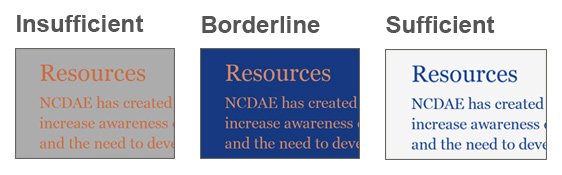
- In most tables, the top row describes the columns of information below it, and in some tables, cells in the first column describe the information to the right. If the tools allow, provide headers for data tables.
- These headers should also be clearly identified visually. For example, the column and row headers below are bold and have a green background:

