

Laura Young discusses visualizations and internal data sharing as a valuable tool for transparency and informed decision making.
We are driven by a commitment to informed decision making in both our evaluation and our programmatic work. But what does this look like in practice?
Over the last several years, we have shifted internally from a siloed work style centered on academic papers describing our programmatic focus to a transparent and collaborative approach across and among programs. This shift included creating a visually-driven dynamic workspace available to the Board and staff 24/7—and visualized shared data soon became the new frontier for making decisions and tracking our progress toward impact.
We want our colleagues, partners, and Board to navigate many sets of complex, dynamic data with minimal cognitive effort and maximum clarity. Data visualization and graphic design give us the best opportunity to do that.
Creating the platform sprang from a desire to keep our Board apprised of strategies, programmatic trajectories and pivots, and learnings. It quickly expanded to become a platform to make knowledge accessible across program teams and leadership in new ways. And, it has improved the way we communicate with data to make better informed decisions.
Our internal platform—named TheLoop—serves as a centralized space to visually depict each program’s unique theory of change.
The visualization of key data allows us to be better storytellers. In fact, TheLoop’s interactivity—from navigating within a program’s section to drilling down into a specific chart—allows the user to become the storyteller: to explore the data, tell the program’s story, and answer questions at their own pace, however they wish.
Visualizing in Practice
Most of the time, simple data graphics and maps not only suffice but are often preferred to depict significant individual measures. They are easily and quickly understood and convey the relationships, trends, outliers, and patterns in the data that static tables inside papers will not.
In our Climate Solutions program, these visuals are particularly varied and informative. For example, as we aim to contribute to mitigating climate change, we want to encourage and follow a shift to renewable energy. Renewable energy has accounted for an ever-increasing share of energy generation in the U.S., and the country is close to producing 20 percent of its energy from renewables by the end of 2020. According to the Energy Information Administration, renewables surpassed coal as a source of energy generation for the first time in April 2019.
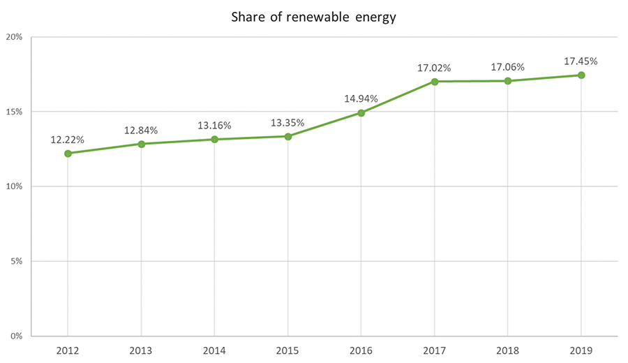
A line graph shows renewable share of total U.S. energy generation.
View raw data pdf ›
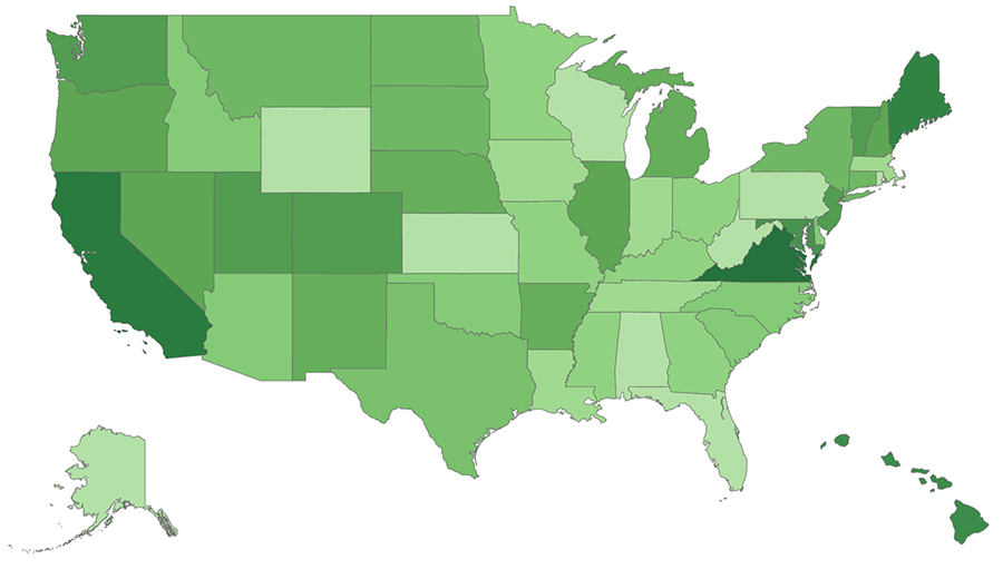
Interactive maps are another way to allow the user to engage with geospatial data. One such map of state level data, shows climate-friendly policies that states have proposed and adopted. This gives the user the opportunity to explore data within the broader national context.
We also appreciate more sophisticated interactive graphics. We occasionally embed complex data visualizations—with permission from the source and a clear citation—into our internal resources because they tell a very specific story in a compelling way. In this case, NASA has created a Climate Time Machine that illustrates the Earth’s changing climate over more than 130 years, allowing users to travel back and forth in time to see the impact on our planet of four climate related variables: sea ice, sea levels, carbon emissions, and average global temperatures.
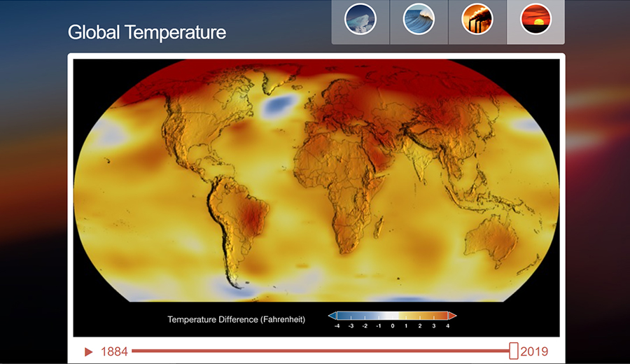
NASA’s Climate Time Machine is a feature of NASA’s Global Climate Change website. Design and programming by Moore Boeck; concept and research by Randall Jackson and Holly Shaftel; Animations by Goddard Scientific Visualization Studio, Moore Boeck, Center for Remote Sensing of Ice Sheets.
Measuring and visualizing what matters tees up constructive conversations. And sharing them allows for grantee partners and other stakeholders to engage with the Foundation during convenings and workshops in a thoughtful, collaborative, and strategic planning process. Whether it is visualizing qualitative data or plotting quantitative information, charts, graphics, and images help us tell “what,” “then what,” and “so what” as we aim to demonstrate the impact of our work.
More Perspectives on Evaluation ›