

James Kinser, Senior Associate, Digital Communications, discusses the thinking and values that shaped our website redesign.
Since we recently shared MacArthur's values, we have been thinking about how they relate to our current website redesign project. They serve as a North star, are woven throughout the entire project, and guide how we use research for the creative evolution of the website.
Learning and Empathy: Redefining Audiences
A central factor to any successful website redesign is understanding our audience. Having a clear picture of who is visiting our site and where they are navigating during their visit substantially shapes our messaging and formatting of content.
To learn more about our audience, we embarked upon a year-long research project to examine website traffic. We conducted interviews, workshops, and surveys with Staff, grantees, people who are familiar with our work, and people who have had no previous interaction with MacArthur.
This comprehensive learning approach allowed us to more intimately empathize with our audiences, so we could meet them where they are and hopefully guide them toward the information they seek. Additionally, the research reframed our thinking about how we group our audiences, reshaped how we communicate information, and clarified what channels we use to share a message.
Diversity, Equity, and Inclusion: Optimizing All Users' Experience
To improve access to our content, we had to think about two foundational elements: accessibility and user experience. Fortunately, these two elements support each other.
As part of our ongoing commitment to accessibility, we knew we needed to make our content available, consumable, and understandable by people with disabilities such as no/low vision, limited mobility or cognition, and color-blindness, among others. Technically speaking, that meant the redesigned website would need to conform to Web Content Accessibility Guidelines (WCAG) 2.2 Level AA. Not only does that approach benefit people with disabilities, but it also improves the user experience broadly and increases search traffic, i.e. the flow of traffic to relevant content on our website based upon keyword searches conducted via Google, Safari, etc.
To optimize the experience for website visitors in varied contexts, we opted for a mobile-first approach. That means that content is first formatted for display on mobile device screens and then is optimized to scale up to tablet and desktop screens. This departure from our previous approach—desktop-first and optimization for tablet and mobile second—brought with it significant benefits.
As we looked at audiences and consumption of content on the site, we discovered that most of our content related to our work in Nigeria was being consumed by people in Nigeria on mobile devices. For our U.S.-based audience, the mobile-first approach meant that we could reduce the time it takes for a page to load, visually prioritize content, and improve user experience regardless of screen size. Ultimately, we expect our inclusive approach to accessibility and mobile-first design will improve access to content for more diverse audiences.
Creativity: Design That Solves for Challenges
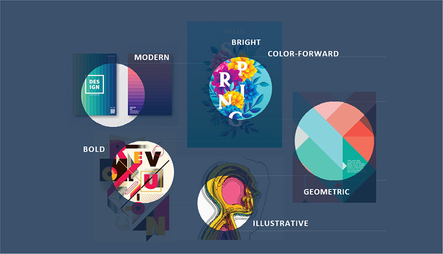
All too often, color and design get shoved to the side and are considered superfluous. But judicious use of color and strategic design paired with a data-informed approach makes for a solid foundation. As in our case, research helped us determine a design approach that is illustrative, color-forward, clean, modern, and bright.
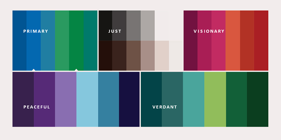
This led us to update a new brand palette and incorporate within it a set of neutrals and skin tones that draw a direct connection to our Just Imperative. The palette of colors and design elements of the new website will help tie together content about the Foundation in a more cohesive way. They will improve navigation throughout the website, offer helpful guides along a visitors’ experience, and bring content forward.
By more strategically surfacing Grantee Stories, Perspectives of Staff and experts in the field, and recent news about grantees, we are more holistically communicating key messages. As we move through the final design phases next year, we expect that both creative problem-solving and our research will guide us to the most successful outcome.
Integrity: Bringing It All Together
At the core of our process are six key goals. Our three primary and long-standing goals for MacArthur’s website are: being transparent, highlighting grantee work, and drawing attention to key topics. Through our research, we discovered the need to add three goals to our redesign process: making accessible and engaged experiences; making connections; and creating a universal system that is flexible and scalable. Collectively, these goals will ensure that visitors of any ability have access to valuable content, and they will also provide opportunities for more engagement around specific issues and topics.
Ultimately, we rely upon data and research for sound judgement in our approach. And in the end, we trust the infusion of all of MacArthur’s values will make our new website more informative, accessible, and understandable. As we move into 2022, research and feedback will continue to inform our final design and build of the website. We expect to launch the redesigned website in 2023.